LiveLight Energy.
How do you change the landscape of home building? By starting with how it uses (or can even produce) energy. LiveLight Energy was born out of the idea that a home should be and could be ‘smarter,’ not only in it’s home energy efficiency and use, but also in how it was designed and built. Launching at the height of the ‘green’ movement, we wanted to stay away from every trite and expected use of imagery and language that was so prevalent at that time. The main logo identity icon was created out of the overlapping of three main elements: Sun, Water, and Earth. These are necessary for life to exist, and the overlap of these three elements produce life: the green. The overall icon also forms the shape of a lotus blossom, subtly referencing the ancient Egyptian ideal of life and rebirth via the sun.

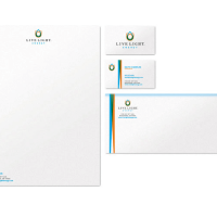
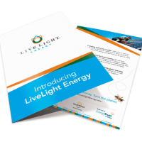
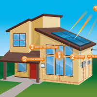
The LiveLight Energy full branding project consisted of the main logo identity, full stationery package, a loyalty badge/seal (used as a sticker for power inverters and cars), a print marketing sales brochure, infographics to explain the solar process, icon creation, trade show banners, and a website design/development (no longer active).

